In this GeoMarvel Live! tutorial, we explore the new Map Viewer in ArcGIS Online, and compare the similarities and differences with Map Viewer Classic. The new Map Viewer has been redesigned with new functionality, and built for an enhanced user experience. Let’s dive into some of the new features and functions that are now available for the new Map Viewer interface.
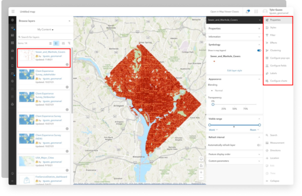
Upon opening the Map Viewer, users will notice the new modern look and feel. While this is more of a cosmetic makeover, it does seem to make the overall experience of using the software more user friendly. Compared to the classic version, Map Viewer has now added a second side panel on the right side of the screen, displaying new and existing functions that are easy to access. With the added ability for the panel to collapse to obtain more map real estate.


When users are ready to bring their data into the map, content access is still located on the left side panel. But now when you bring your content in, all the properties and functions will then be presented on the new right side panel. Some of these familiar features include filters, styling and clustering. This new panel helps save the time and effort of clicking through multiple layers within the “details” page of the classic version.
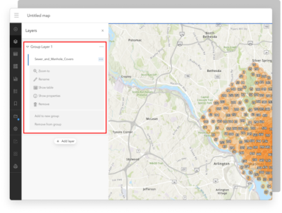
One of the most requested features on the ArcGIS Ideas page, which is now available, is the ability to group and rearrange layers in ArcGIS Online. You can have multiple sublayers of data within a specific group. If users wanted to add layers to a specific group, they would add the content like normal, and in the details section there is an option to add to either a new group or move to an existing group. Properties and functions can also be adjusted for each specific layer on the right side panel.


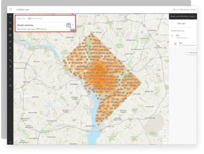
While analyzing the layers on your map, users have the ability to click on any of the data points to view the pop-up. Pop-ups present users with the associated attribute information for their specific point of interest. In Mapviewer classic the pop-up would stay in a static spot on the screen, but now users are now able to dock the pop-ups and move them to a corner of the screen. Being able to dock these pop-ups allows for better utilization of the map.
When it comes to saving your work, the process is a little different when you compare the two versions. In Mapviewer classic, users have the ability to save the specific layers they’ve been working on. While in the new version there is no option to save just the layers, instead you have to save the full map. Providing the ability to save title, tags, a summary, and the folder in which it will be saved.


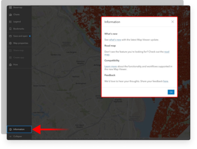
While Map Viewer is now out of beta version it should be noted that there are still additional incoming functionalities. For example, the ability to analyze layers within your map is not available yet, but will be in future updates. If you still have questions or are just curious about upcoming updates, make sure to check out the information tab located at the bottom of the left side panel for additional resources.
We hope you enjoyed this GeoMarvel Live! tutorial that focused on comparing the newly released Map Viewer with the Classic map viewer. We navigated between the two versions to identify some of the key differences. Hopefully you learned something new, and you’re now ready to dive into the New Map Viewer. If you enjoyed this tutorial make sure to drop a comment below to let us know your thoughts!
Start leveraging the new Map Viewer to learn more about your data. Don’t have an ArcGIS account? Jumpstart your GIS with our Web Launch Kit or ArcGIS Jumpstart services. Already integrated with the ArcGIS system? We’ll help you build out your next big idea. Contact our industry experts to start a conversation about your unique GIS needs today.