Award winning.
A proud
Esri
business partner.
Together
we can do anything!

Creating High-Fidelity Wireframes using Figma

UX/UI Design - How to Create a High-Fidelity Mapping Interface

Our UX/UI designer is back to demonstrate how to create a high-fidelity mapping interface using Figma – a web-based interactive and collaborative design tool that gives you the opportunity to implement your creativity.

Learn more below about high-fidelity design, how to transform a low-fidelity mapping interface to high-fidelity and what tools to use in Figma to bring your designs to life.

What are High-Fidelity Designs?

Low-fidelity wireframes are gray-scale blueprints of app screens that help keep the focus on the overall layouts, functionalities and flow of your design. Once you’ve confirmed what will be included in your app, you are ready to build high-fidelity designs.

What high-fidelity wireframes do is show details of form and function and provide a more realistic blueprint of the design to communicate what the final product will look like.

That means giving your design elements depth, including real content, hi-resolution graphics, precise spacing, branding elements, typography, iconography and an incorporation of a color palette that corresponds with the product’s style guide. Applying these techniques provides a more refined and precise user interface.

High-fidelity wireframes are highly detailed and communicate the design accurately. They also ease the process of understanding and visualizing the design for stakeholders, as well as for the development team to build the product.

High-Fidelity Wireframing for a Mapping Application

In this tutorial video, we transform the low-fidelity wireframe we created in the previous tutorial of a simple mapping interface, to high-fidelity. When designing a high-fidelity mapping interface, consider the following:
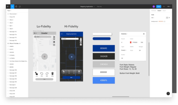
  • Although the map takes up most of the screen, it remains imperative to implement the grid, so the elements that sit atop the map have ample padding and are in perfect alignment.
  • Which basemap to use for high-fidelity. We initially used a gray-scale map as a placeholder, but now you can choose from multiple basemap types, such as night time street map through your ArcGIS portal. 
  • Ensure the map is zoomed in to show the user location.
  • In this high-fidelity design, we dragged the map to cover the whole of the screen to establish a dark look and reiterate on the importance of the map as the focal point.
  • Enhance the basic map widgets, search bar, toolbar and button by giving them color, contrast and depth.
  • Make sure the color palette is consistent by using the established hex codes in the style guide.
  • Consistent font type and weight for their respective functions.
  • Location icon is an accurate depiction of common user practices.

Figma Tools

Here are some tools in Figma to keep in mind when designing for high-fidelity: 
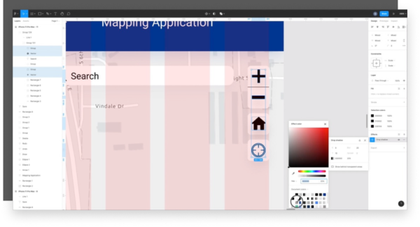
  • Click on the frame before activating the layout grid feature in the right panel. The grid will help you keep your content aligned and spaced precisely for the ultimate user experience. It’s helpful to remember to keep spacing in multiples of 8.
  • Once clicking on an element, you can manipulate the size and corner radius in the upper right hand toolbar. Buttons are usually no less than 42 pixels and no more than 72 pixels for proper usability, studies show
  • Use the drop shadow effects in the right toolbar to incorporate depth. You can make the y axis 10, the blur 20 and the color of the dropshadow close to the fill color with a transparency of 10 – 15%. This will give the element a realistic shadow effect.
  • Once you’ve established the element properties, you can make it a component by selecting it and clicking on the component icon in the center top toolbar or right clicking and selecting “create component”. Afterwards, you can go to the assets tab in the left hand toolbar, next to layers, and drag and drop a component to reuse. If you want to update the element, such as the color, you can edit the main component and the changes will automatically be applied to the rest of the elements linked to that component.
  • Create space bars using the shape option on the left side of the top toolbar to help you space elements on the screen accurately. This will ensure your design has a spacious, clean and concise look.

Join us in building a high-fidelity screen on our Youtube channel using Figma. Make sure to subscribe, comment across any of our social media platforms, and drop any suggestions for new topics to cover. And don’t worry, we’ll be back for more!