ArcGIS Pro is a platform enabling you to create and manage data, make 2D and 3D maps, and perform in-depth analysis using a range of available geoprocessing tools. Once you’ve completed your mapping and analysis needs, it’s time to share your maps, data, and findings quickly and easily as a 2D map or 3D scene, all with the click of a button.
Not familiar with ArcGIS Pro? Get to know the user interface, and start working with the ribbon, panes, and views in this 25 minute exercise from esri. Already familiar with ArcGIS Pro? Good thing there’s always more in the works! Check out what’s new in ArcGIS Pro 2.3.
Working with ArcGIS Pro Stream Layers
Stream layers operate similarly to the feature layers you’re used to, but they rely on stream services as their data source. Let’s dive in and add a stream layer to ArcGIS Pro, customize the data, and analyze to reveal hidden patterns and insights for the data collected.
Tracking airplane flight paths in and out of Minneapolis-St. Paul Airport
In this example, we’re watching arriving and departing flights for the Minneapolis-St. Paul Airport. Let’s take a quick walk through bringing in the streaming layer, appropriately symbolizing the data, leveraging the HEADING field for the flight paths, and creating a sound corridor buffer surrounding flight paths.
Add the Streaming Layer
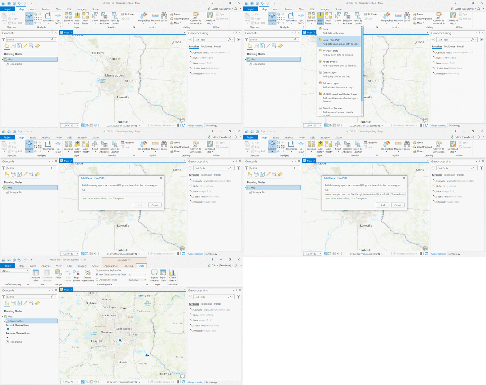
From the Map tab, click Add Data, and select Data from Path. Paste in your desired stream layer URL. Explore some of the available sample layers from esri.
Symbolize the Data
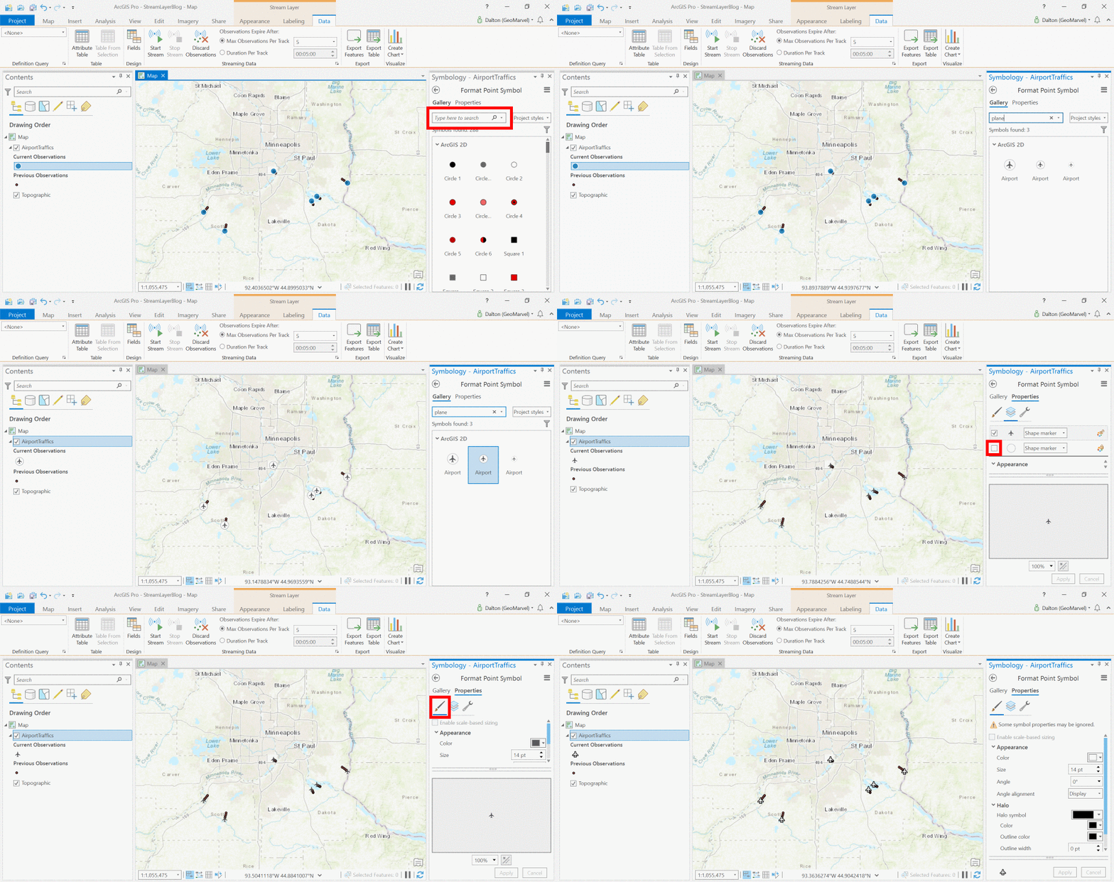
Since we’re modeling airplane flight paths, we should symbolize accordingly. Let’s replace the default dot symbol with an airplane symbol customized for maximum visibility.
Orienting Direction by HEADING Attribute
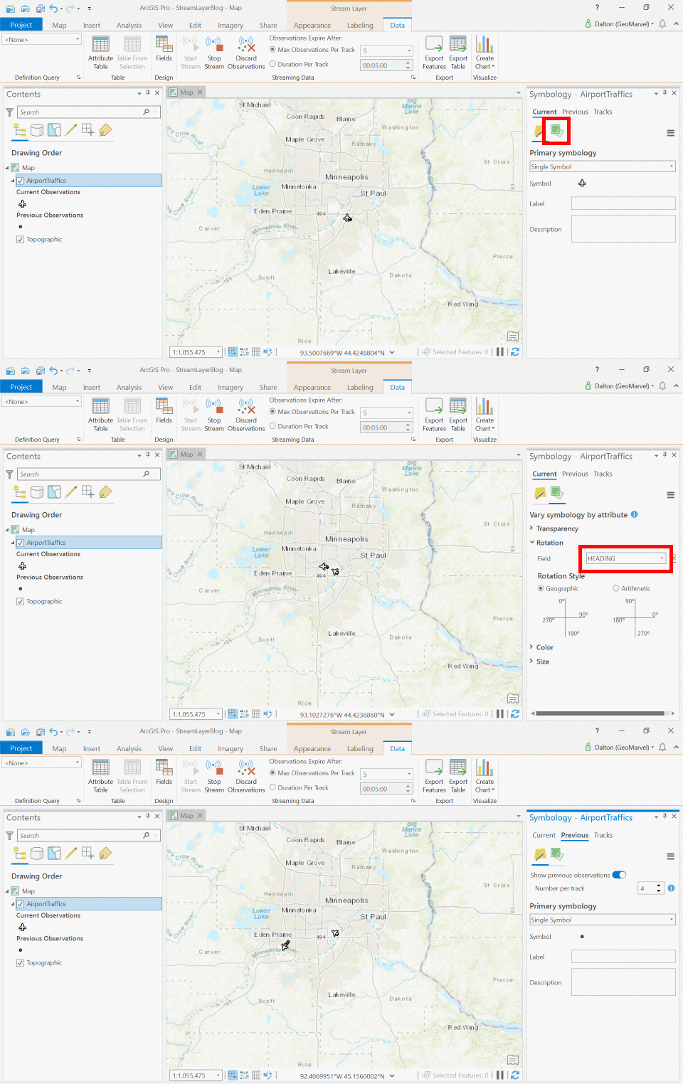
We’ve successfully symbolized our airplanes, now let’s point them in the right direction. By default, the airplane symbols all point in the same direction, but we’re pretty sure they aren’t flying sideways, so let’s leverage the HEADING attribute to properly orient the airplanes.
Symbolize Airplane Tracks by ELEVATION
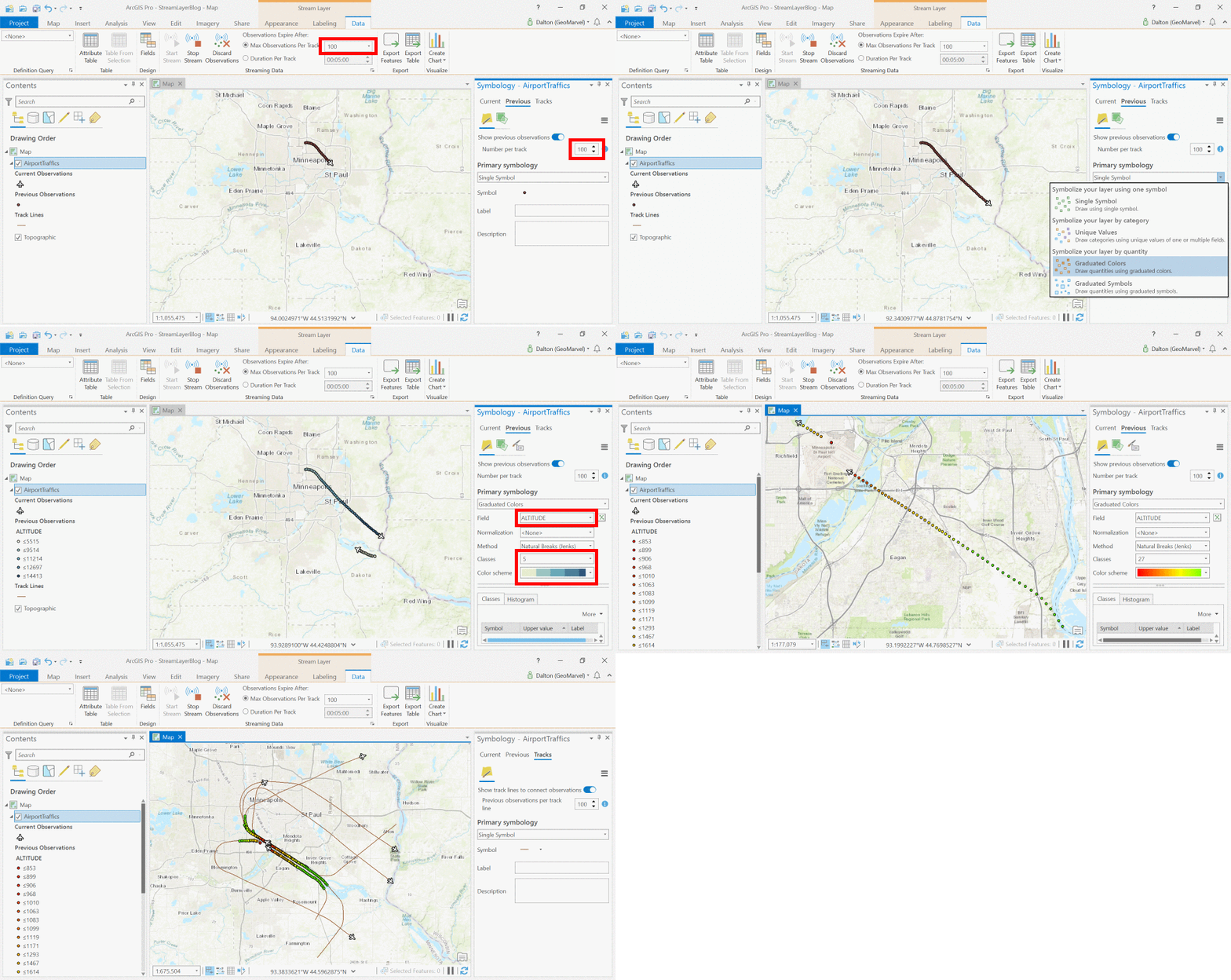
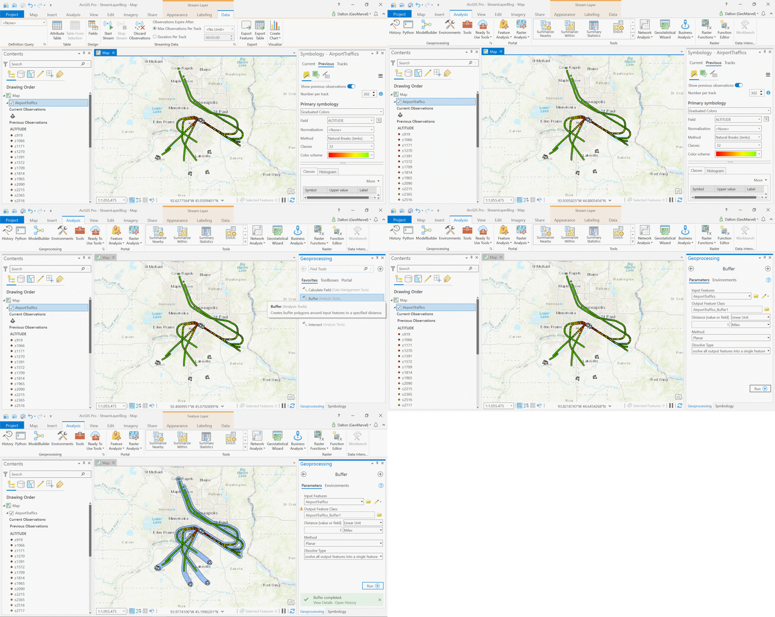
We can visualize where each airplane has been by examining their flight paths. But let’s take the flight paths one step further to depict how the airplanes are changing in elevation. By symbolizing via a color ramp, we can provide an easy visualization of how quickly the airplanes are changing in elevation in this area.
Buffer Analysis to Visualize Noise Corridor
By letting the stream layer run, we can collect flight paths for several airplanes to visualize the common corridors traveled by all incoming and outbound airplanes. By adding a buffer to all flight tracks, this information can be extrapolated to depict the areas most impacted by noise pollution surrounding the airport.
Get Support
This was a simple example of leveraging stream layers within ArcGIS Pro to reveal valuable insights. Want to leverage ArcGIS Pro streaming layers in your workflow? Contact our industry experts to start a conversation today.

