Operations Dashboard for ArcGIS is a configurable web app that provides location-aware data visualization and analytics for a real-time operational view of people, services, assets, and events. From a dynamic dashboard, view the activities and key performance indicators most vital to meeting your organization’s objectives. Operations Dashboard for ArcGIS also leverages all of your organization’s existing ArcGIS data, taking it further with the added functionality of bringing in data from other sources, like real-time feeds, to give additional value and comparison. With the integration of ArcGIS Online (AGOL), your organization can share its dashboards and gauge who they are used by – members of the organization, a team, or the entire AGOL community.
Common View | Support collaboration by providing a common operating view of key performance indicators to help everyone understand what is working well and what needs attention.
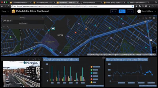
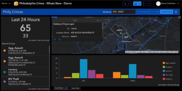
Ready to Use | Enrich your data with a diverse set of visualization tools to enable actionable decision-making. Give stakeholders at-a-glance insights into key performance indicators.
Flexibility | Adapt to any situation or event, whether it’s simple or complex, indoor or outdoor. Monitor the people, services, assets, and actions that are most relevant to your event or activities.
Real-Time Updates | Monitor, track, and assess the critical factors for successful operations, even as a situation develops. Use data analytics to support strategic and tactical decisions across your organization.
Configurability | Create and configure dashboards to be independent or interactive. Provide a common view on the wall of your operations center, or get a drill-down view that can be filtered at your desk.
Create a Dashboard | Start with a clean slate and launch Operations Dashboard for ArcGIS from the App Switcher or by creating a new web app from a web map.
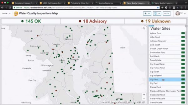
Add Featured Elements | Select from a rich library of visual elements—charts, indicators, gauges, lists, maps, and more. Configure your data and visualization to present it your way.
Customize Layout | Drag, group, stack, and resize elements. You can move them around, adjust their size, and try different colors or background themes.
Build Interactivity | Use the framework to control elements within your dashboard. Build interactions that let users derive key performance indicators.
Save, Test, Deploy | Once you have saved your adjusted dashboard, you will want to test to be sure it works the way you need it to. Then, you’re ready to share it with others.
Interested in learning more about Operations Dashboard for ArcGIS features and usage? Contact one of our experts at support@geomarvel.com to learn more about how you can begin implementing this cutting-edge tool into your lines of business today!